
Introduction
In today’s digital world, having a mobile-friendly website is no longer optional—it’s essential. More than 58% of global website traffic now comes from mobile devices (Statista, 2024), and Google has officially adopted mobile-first indexing, meaning your website’s mobile version is the primary factor in search engine rankings.How to Build a Mobile Friendly Website If your site isn’t optimized for smartphones and tablets, you risk losing visibility, traffic, and potential customers.
This comprehensive guide will walk you through how to build a mobile-friendly website, covering everything from responsive design and performance optimization to SEO strategies and usability best practices. We’ll also explore real-life examples, case studies, pros and cons of different approaches, and practical tips you can apply immediately.
By the end of this article, you’ll have a clear roadmap for creating a site that not only looks great on mobile devices but also drives engagement, conversions, and long-term growth.
Why Mobile-Friendly Websites Matter
1. User Experience and Engagement
A mobile-friendly site ensures that users can easily navigate, read, and interact with your content without pinching or zooming. According to Google, 61% of users are unlikely to return to a site they had trouble accessing on mobile.
2. SEO and Google Rankings
Since 2019, Google’s mobile-first indexing has prioritized mobile-friendly websites in search results. If your site is not optimized, you risk losing rankings even if your desktop version is flawless.
3. Conversions and Sales
Mobile users are action-oriented. For instance, 74% of mobile users say they’re more likely to revisit a site that is mobile-friendly. If your website loads slowly or looks broken on a phone, you’re leaving money on the table.
4. Competitive Advantage
Many small businesses still lag behind when it comes to mobile optimization. Having a mobile-friendly site gives you a competitive edge, especially in industries where user experience can make or break a sale.
Key Characteristics of a Mobile-Friendly Website
When building a mobile-optimized site, you need to ensure the following:
- Responsive Design: The layout adjusts seamlessly across different screen sizes.
- Fast Loading Speed: Pages should load within 3 seconds on mobile.
- Easy Navigation: Menus and buttons should be large enough to tap easily.
- Readable Text: Font sizes should be legible without zooming.
- Touch-Friendly Design: No tiny links or closely packed buttons.
- Minimal Pop-Ups: Intrusive pop-ups can frustrate mobile users and lead to higher bounce rates.
- Optimized Media: Images and videos should be compressed without losing quality.
Step-by-Step Guide: How to Build a Mobile-Friendly Website
Step 1: Choose a Mobile-Responsive Framework or CMS
Most modern websites are built using content management systems (CMS) like WordPress, Shopify, or Wix. These platforms offer responsive themes that automatically adapt to mobile screens.
- WordPress: Use responsive themes like Astra, GeneratePress, or Divi.
- Shopify: All Shopify themes are mobile-friendly by default.
- Wix/Squarespace: Built-in drag-and-drop editors optimize layouts for mobile devices.
👉 Pro Tip: Test the theme on multiple devices before finalizing.
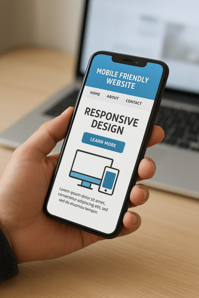
Step 2: Implement Responsive Web Design
Responsive design uses CSS media queries and flexible grids to adjust the layout based on screen size.
For example:
@media only screen and (max-width: 600px) {
  body {
    font-size: 16px;
  }
  .container {
    width: 100%;
  }
}
This ensures your site looks good on smartphones, tablets, and desktops.
Step 3: Optimize Website Speed for Mobile
Speed is a ranking factor. Google recommends a load time of under 3 seconds.
Best practices for mobile speed optimization:
- Compress images using tools like TinyPNG or ShortPixel.
- Minify CSS, JavaScript, and HTML.
- Use a Content Delivery Network (CDN).
- Enable browser caching.
- Choose a fast web hosting provider.
📌 Case Study: Walmart saw a 2% increase in conversions for every 1-second improvement in page load speed.
Step 4: Simplify Navigation and Menus
Mobile users prefer minimalist navigation. Use hamburger menus, sticky headers, and clearly labeled buttons.
Do’s:
- Keep menu items limited to 5–7.
- Use icons and labels for clarity.
- Add a search bar for quick access.
Don’ts:
- Avoid tiny dropdowns.
- Don’t overload the homepage with links.
Step 5: Prioritize Readability
Text that looks fine on desktop may be hard to read on mobile.
- Minimum font size: 16px for body text.
- Use short paragraphs and bullet points.
- Ensure proper line spacing and contrast.
👉 Example: Airbnb uses clean fonts and plenty of white space for easy readability.
Step 6: Optimize Images and Videos for Mobile
- Use responsive images with
srcsetto deliver the right resolution for each device. - Convert images to next-gen formats (WebP, AVIF) for faster loading.
- Use lazy loading to delay off-screen images.
- Ensure videos are embedded with responsive players (YouTube, Vimeo).
Step 7: Make CTAs Mobile-Friendly
Your Call-to-Action (CTA) buttons should be large, clickable, and visible without scrolling.
Example:
- Amazon places “Buy Now” and “Add to Cart” buttons prominently above the fold on mobile.
Step 8: Avoid Intrusive Pop-Ups
Google penalizes websites that use full-screen pop-ups blocking content on mobile. Instead, use:
- Small banners
- Slide-ins
- Exit-intent popups
Step 9: Test Your Mobile-Friendliness
Tools to test your site:
- Google Mobile-Friendly Test (checks usability issues).
- PageSpeed Insights (analyzes performance).
- BrowserStack (tests across multiple devices).
Step 10: Optimize for Mobile SEO
Building a mobile-friendly site is only half the battle—you must also optimize for mobile search.
Mobile SEO tips:
- Use short, keyword-rich titles.
- Optimize meta descriptions for click-through rates.
- Implement schema markup for rich snippets.
- Optimize for voice search with conversational keywords.
- Ensure local SEO optimization (especially for small businesses).
Pros and Cons of Building a Mobile-Friendly Website
| Pros | Cons |
|---|---|
| Better SEO rankings | May require redesign or migration |
| Enhanced user experience | Higher initial cost for development |
| Increased conversions and sales | Ongoing maintenance needed |
| Competitive advantage | Need for continuous speed optimization |
| Future-proof with mobile-first indexing | Possible plugin/theme compatibility issues |
Real-Life Examples of Mobile-Friendly Websites
- Amazon – Streamlined design, large CTAs, and quick checkout.
- Starbucks – Mobile-first design with easy menu browsing and order placement.
- Airbnb – Clean layout, strong visuals, and intuitive navigation.
- BBC News – Prioritizes fast-loading articles with responsive media.
Actionable Insights
- Always design mobile-first, then scale up for desktop.
- Focus on user intent—mobile users often want quick answers.
- Regularly audit your site for speed and usability issues.
- Use analytics tools to track mobile engagement and conversions.
Conclusion
Building a mobile-friendly website is no longer just a best practice—it’s a necessity. From boosting SEO rankings to improving user experience and driving conversions,How to Build a Mobile Friendly Website mobile optimization directly impacts your online success.
By following this step-by-step guide—choosing a responsive framework, optimizing speed, simplifying navigation, How to Build a Mobile Friendly Website ensuring readability, and testing regularly—you’ll create a site that performs well across all devices.
In a world where mobile dominates digital traffic, How to Build a Mobile Friendly Website investing in mobile-friendliness is one of the smartest decisions you can make for long-term business growth.
FAQs About Mobile-Friendly Websites
Q1. What does it mean for a website to be mobile-friendly?
A mobile-friendly website is one that displays correctly on smartphones and tablets, offering easy navigation, How to Build a Mobile Friendly Website readable text, and fast loading times.
Q2. How do I know if my website is mobile-friendly?
You can test your site using Google’s Mobile-Friendly Test or PageSpeed Insights to identify issues and get optimization suggestions.
Q3. Is responsive design the same as mobile-friendly design?
Responsive design is a method of creating mobile-friendly websites. It ensures layouts adapt to different screen sizes, making the site accessible on all devices.
Q4. Can I make my existing website mobile-friendly?
Yes. You can switch to a responsive theme, redesign your site, or use plugins and tools to improve mobile compatibility.
Q5. How much does it cost to build a mobile-friendly website?
Costs vary depending on complexity. A basic responsive site may cost a few hundred dollars, while custom mobile-optimized designs can cost several thousand.
How to Build a Mobile Friendly Website How to Build a Mobile Friendly Website How to Build a Mobile Friendly Website How to Build a Mobile Friendly Website How to Build a Mobile Friendly Website How to Build a Mobile Friendly Website How to Build a Mobile Friendly Website How to Build a Mobile Friendly Website How to Build a Mobile Friendly Website How to Build a Mobile Friendly Website How to Build a Mobile Friendly Website How to Build a Mobile Friendly Website How to Build a Mobile Friendly Website